Snoack Studios
Portfolio
About
Services
Contact
»
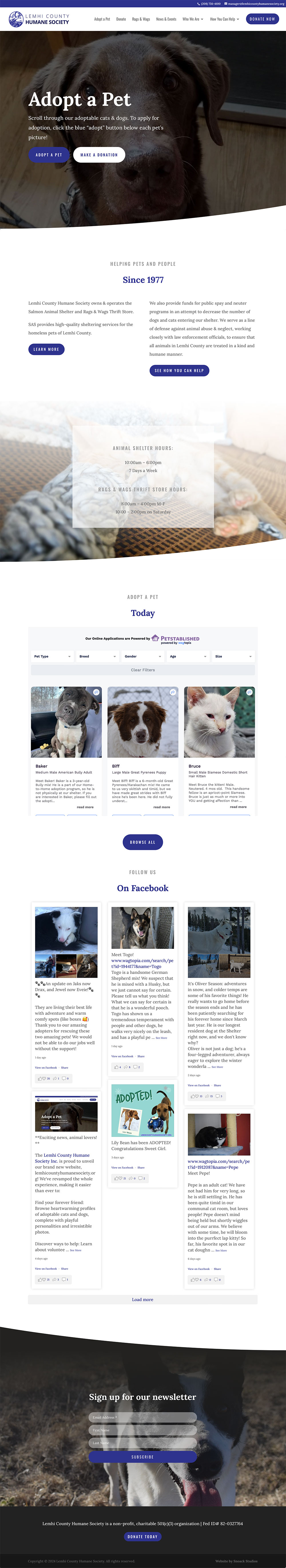
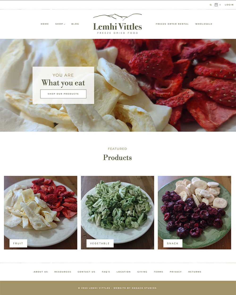
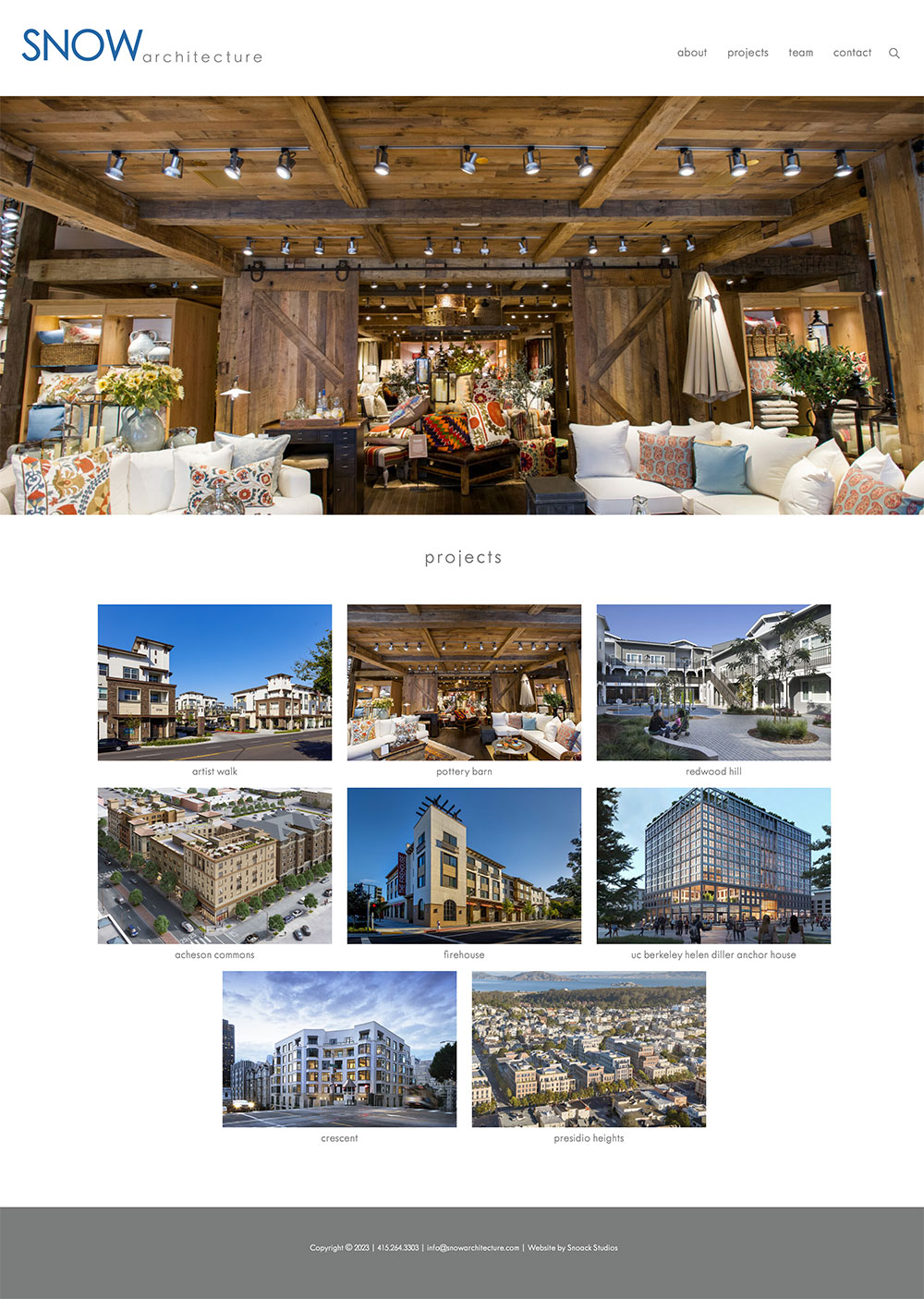
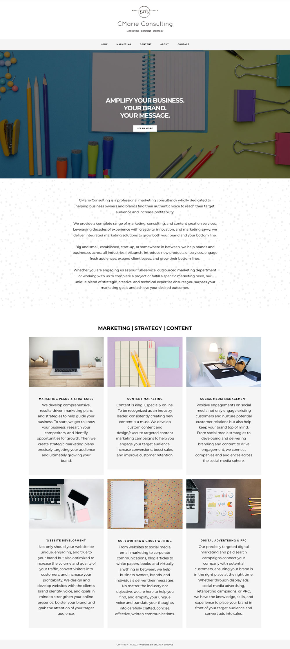
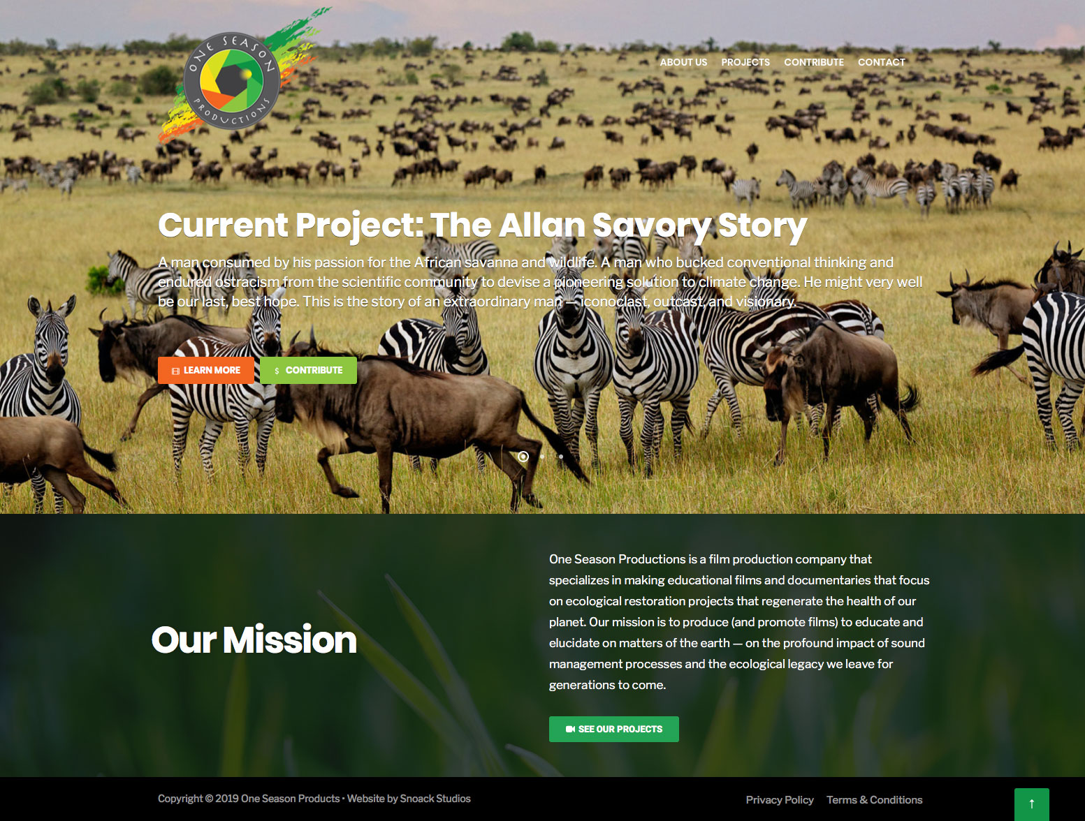
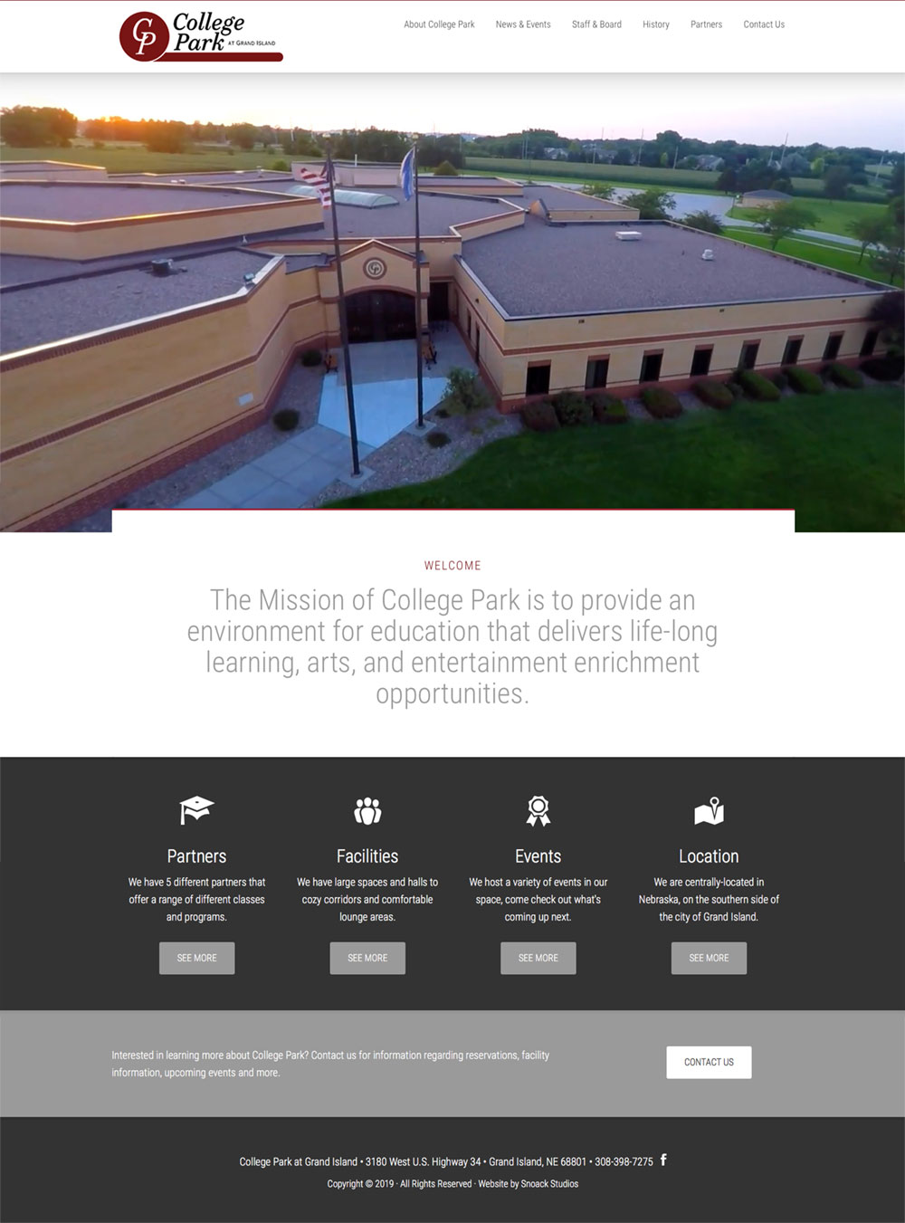
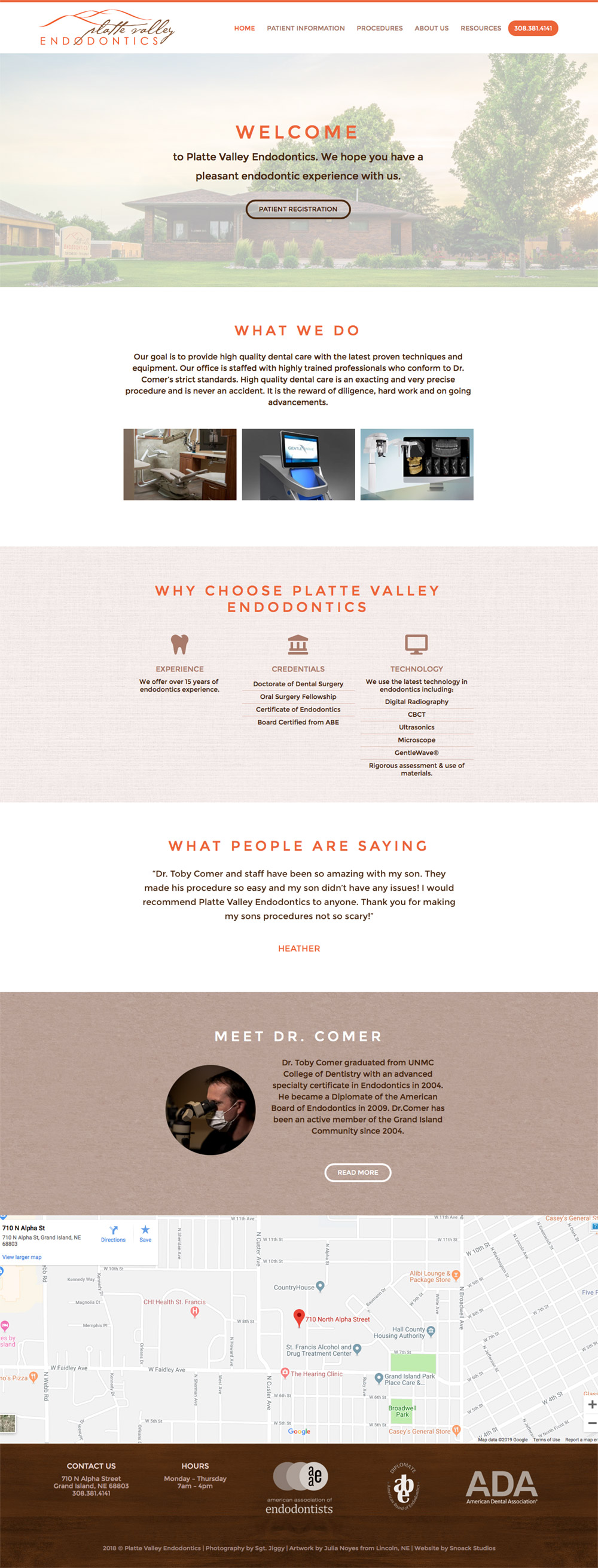
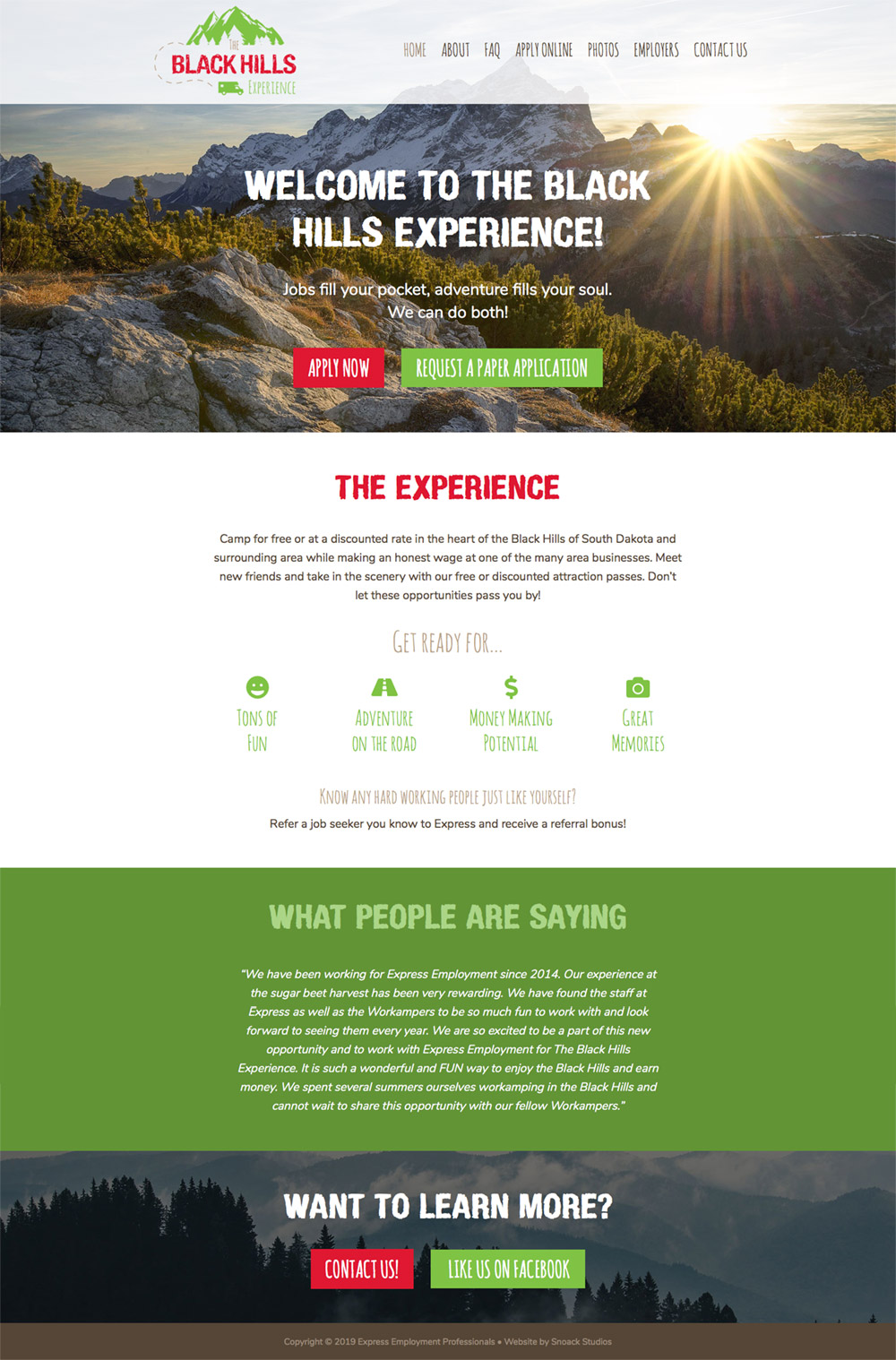
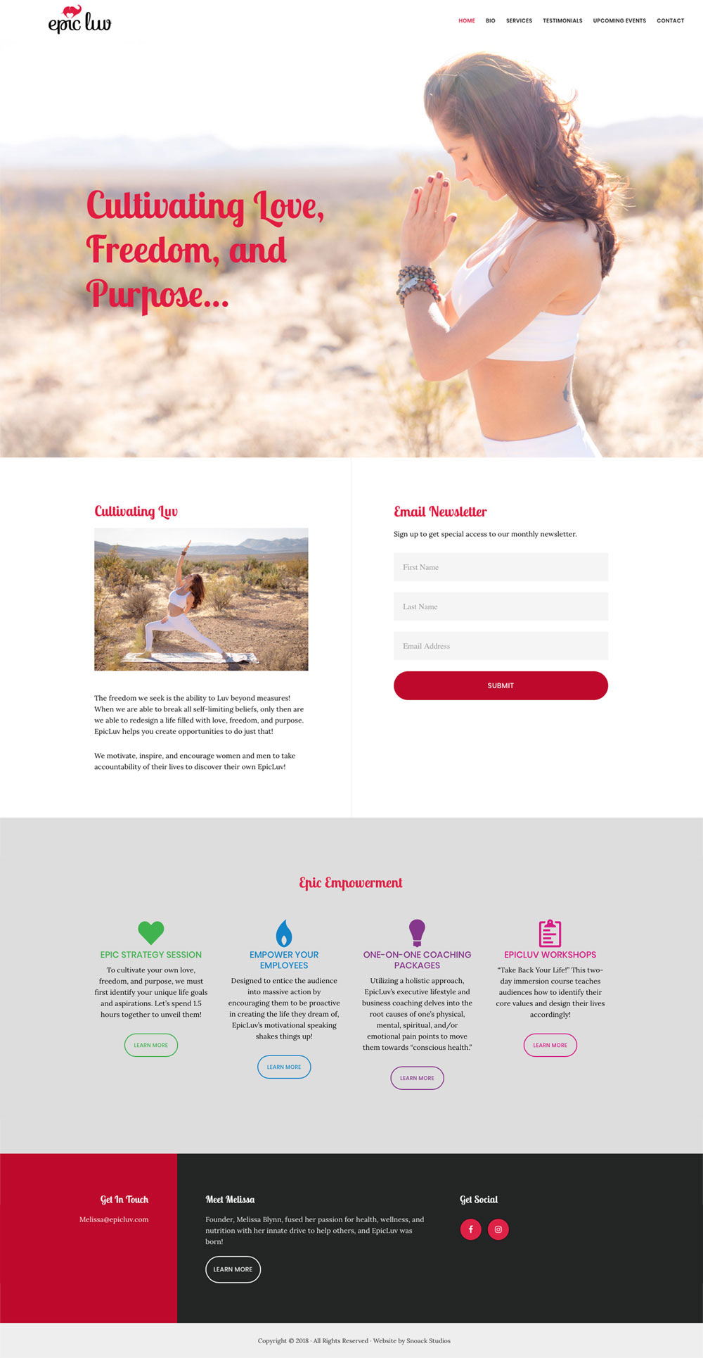
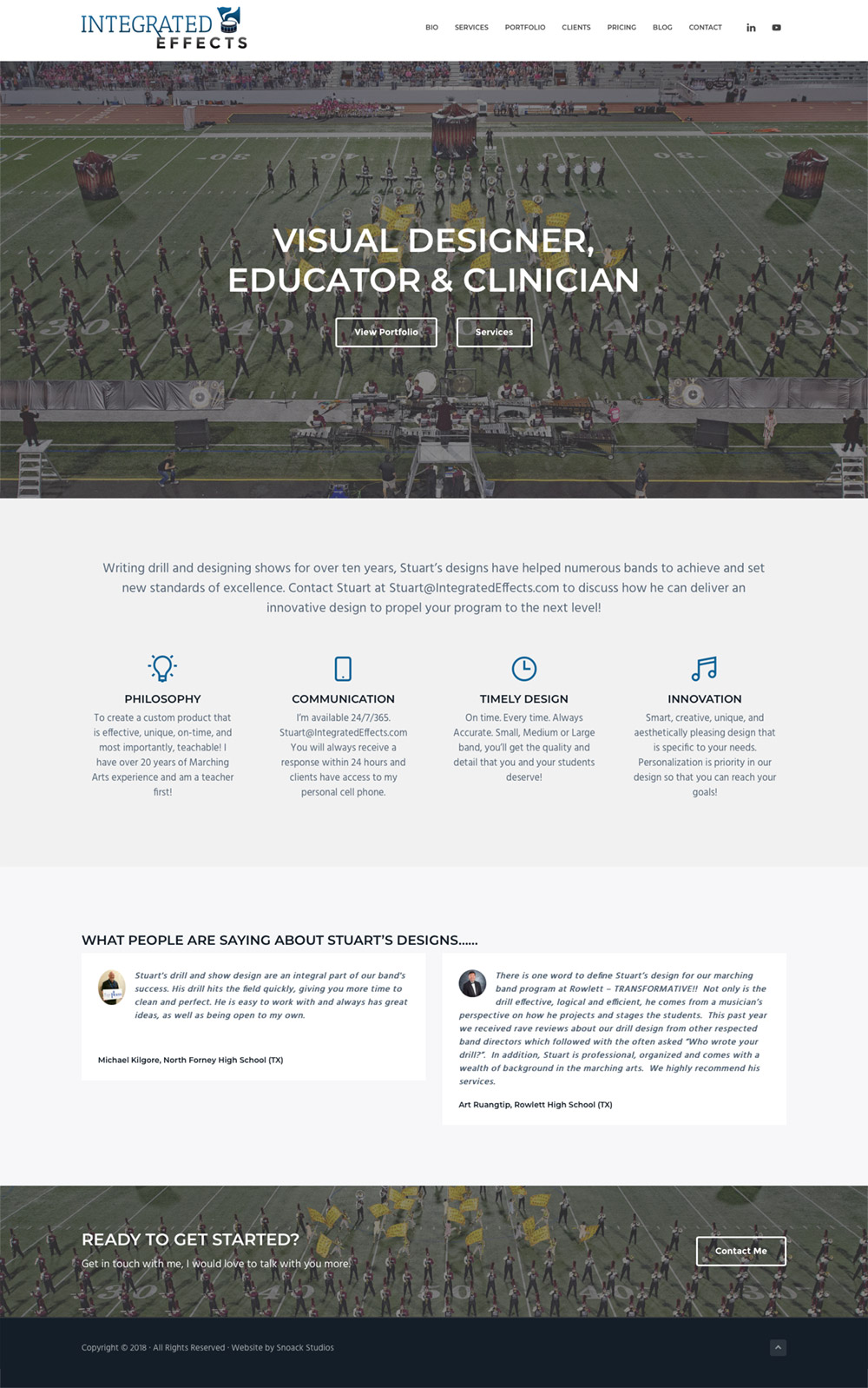
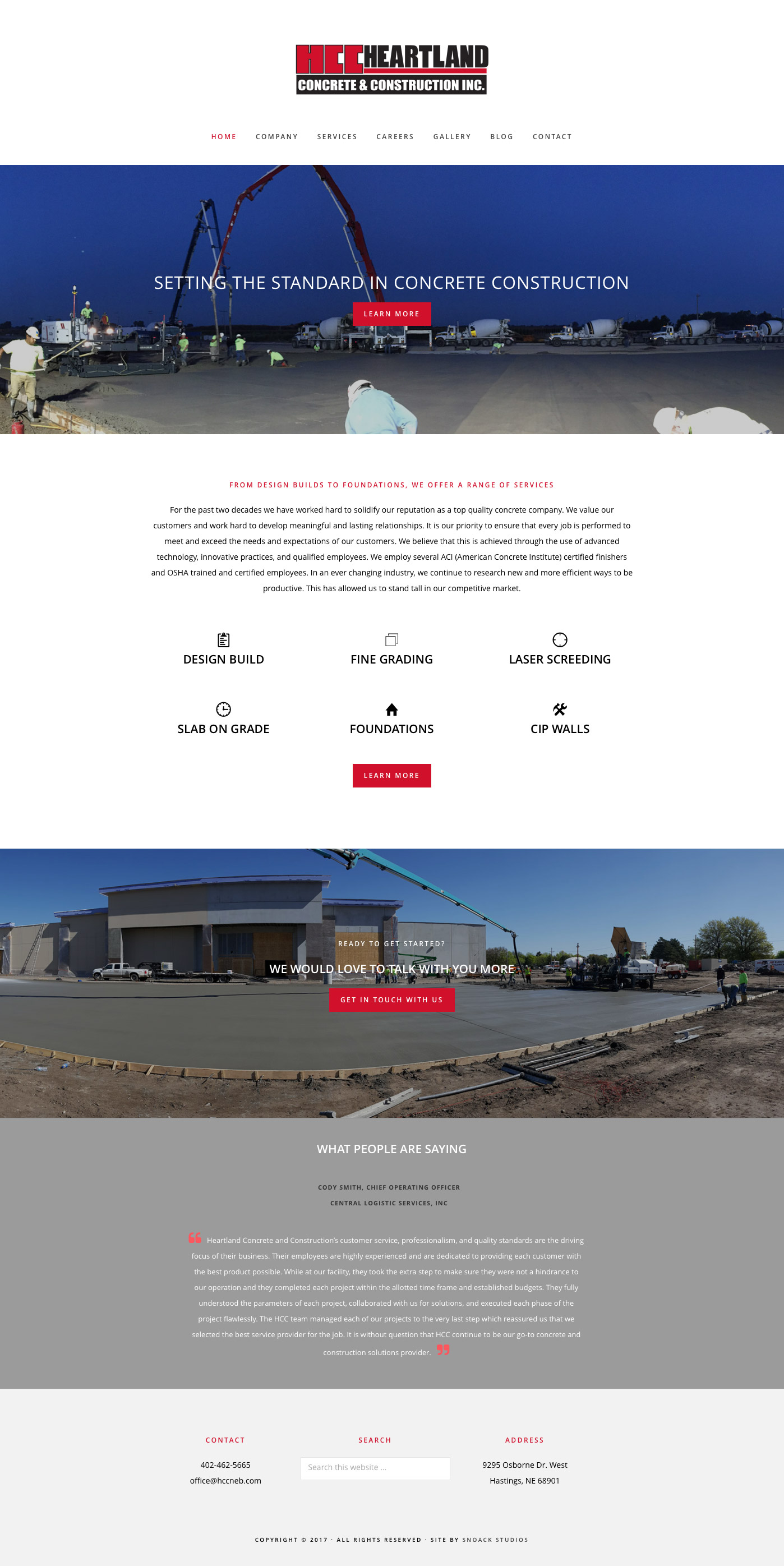
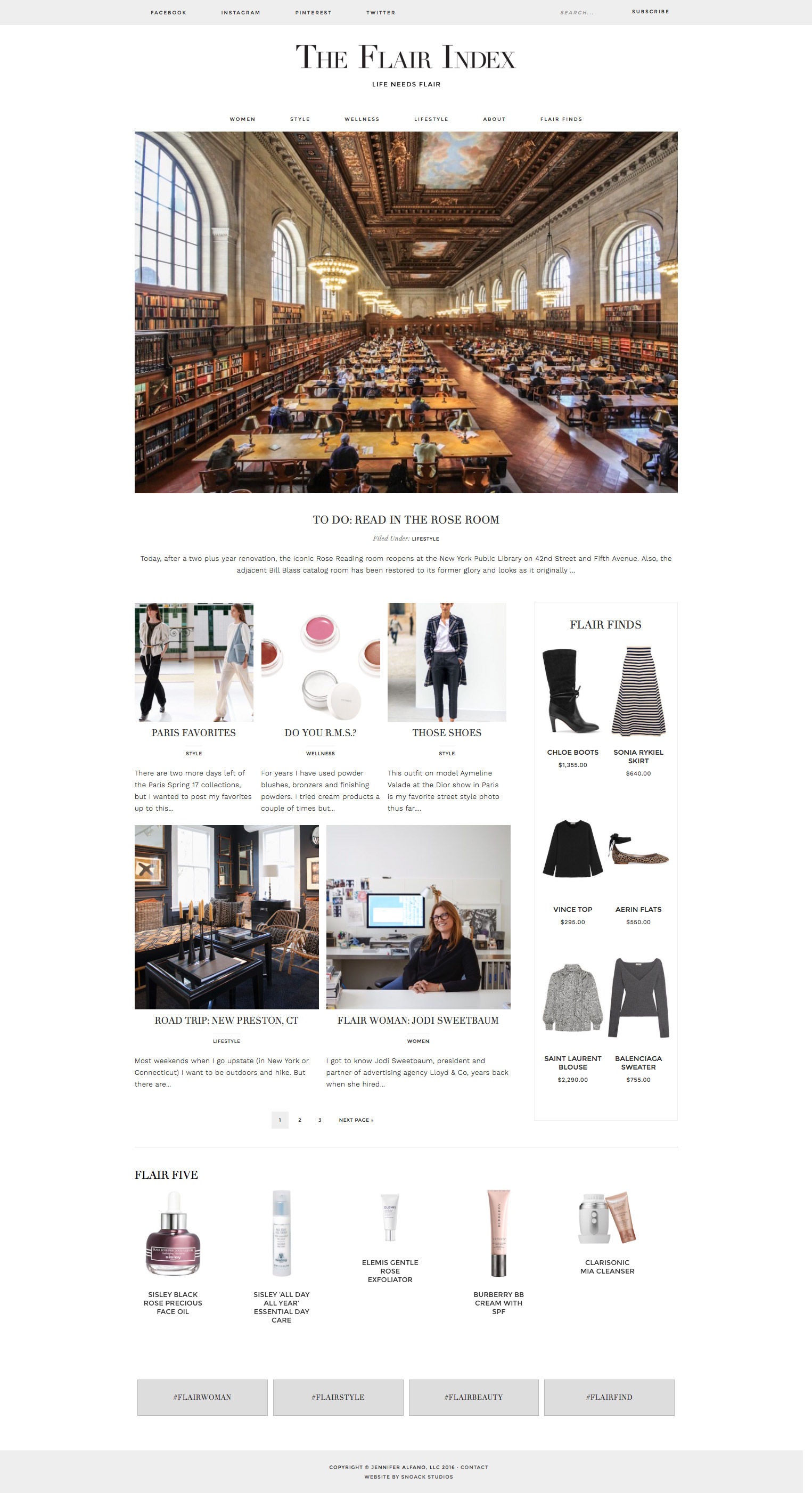
Portfolio
websites
logos
print
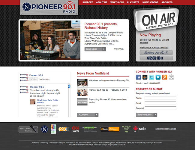
Websites
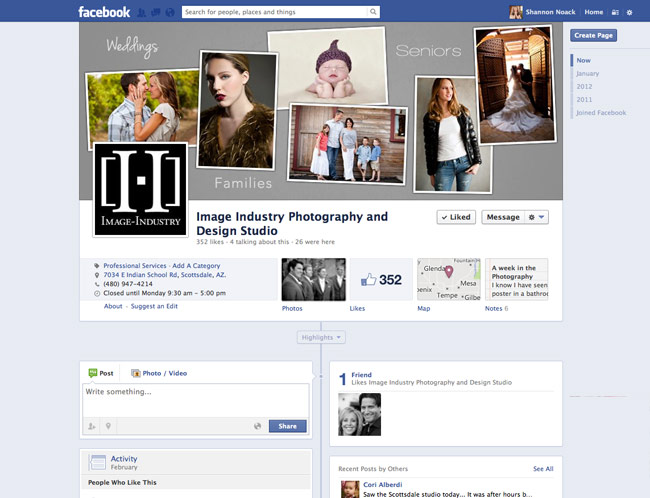
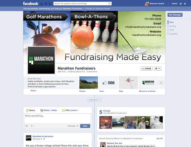
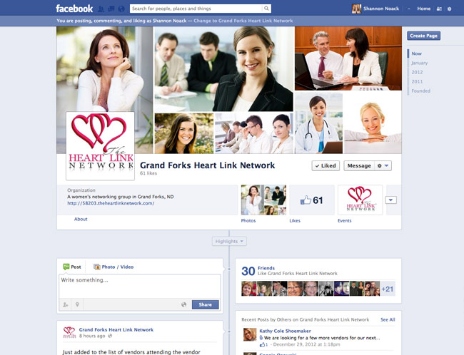
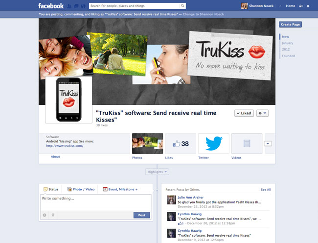
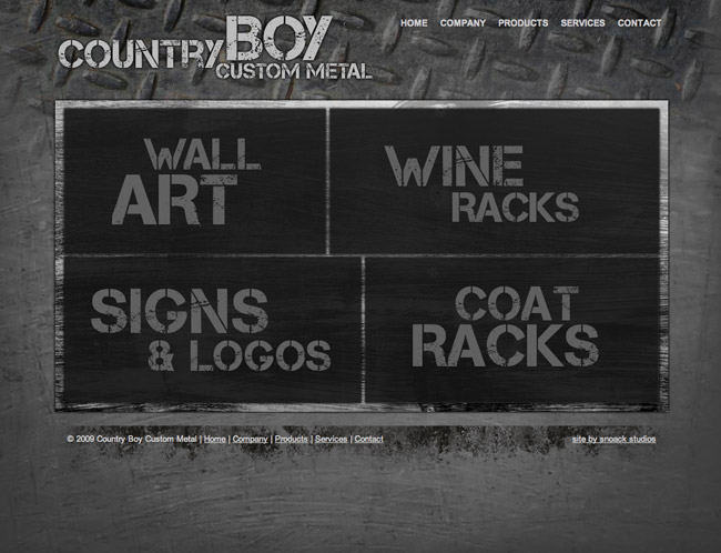
Click on the thumbnail images below to see more about each project.